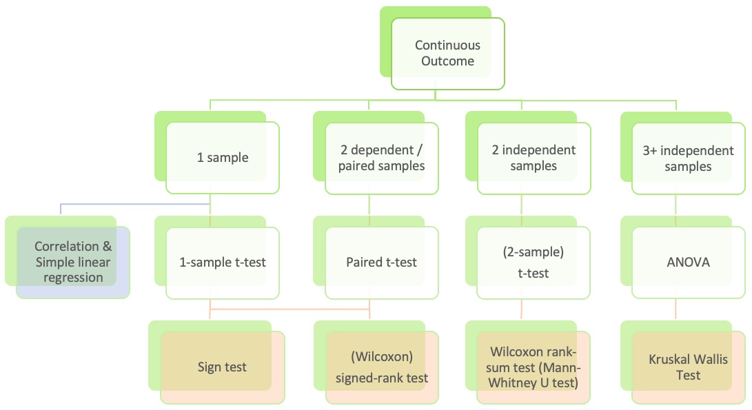
Goals for today (Sections 6.3-6.4)
Simple Linear Regression Part 2
Review of
best-fit line (aka regression line or least-squares line)
residuals
population model
LINE conditions and how to assess them
New diagnostic tools:
Normal QQ plots of residuals
Residual plots
Coefficient of determination (\(R^2\) )
Regression inference
Inference for population slope \(\beta_1\)
CI for mean response \(\mu_{Y|x^*}\)
Prediction interval for predicting individual observations
Confidence bands vs. predictions bands
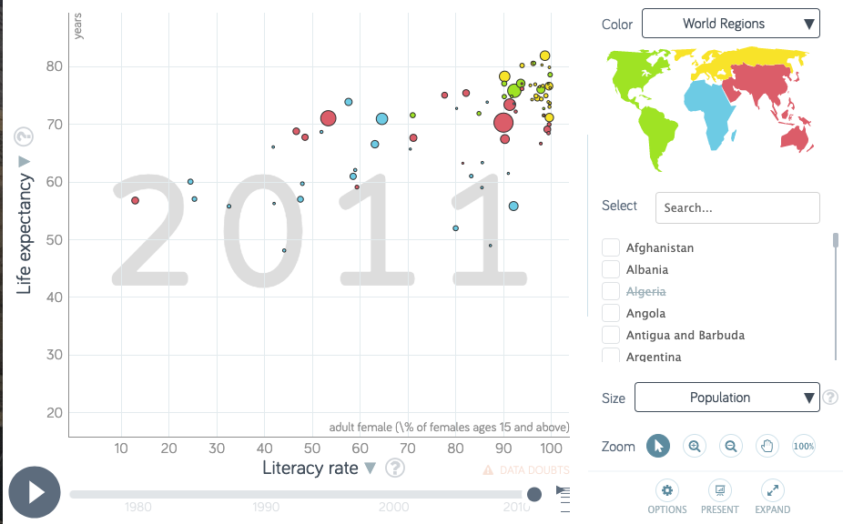
Dataset description
Data file: lifeexp_femlit_water_2011.csv
Data were downloaded from https://www.gapminder.org/data/
2011 is the most recent year with the most complete data
Life expectancy = the average number of years a newborn child would live if current mortality patterns were to stay the same. Source: https://www.gapminder.org/data/documentation/gd004/
Adult literacy rate is the percentage of people ages 15 and above who can, with understanding, read and write a short, simple statement on their everyday life. Source: http://data.uis.unesco.org/
At least basic water source (%) = the percentage of people using at least basic water services. This indicator encompasses both people using basic water services as well as those using safely managed water services. Basic drinking water services is defined as drinking water from an improved source, provided collection time is not more than 30 minutes for a round trip. Improved water sources include piped water, boreholes or tubewells, protect dug wells, protected springs, and packaged or delivered water.
Get to know the data
Load data
<- read_csv (here:: here ("data" , "lifeexp_femlit_water_2011.csv" ))
Rows: 194 Columns: 5
── Column specification ────────────────────────────────────────────────────────
Delimiter: ","
chr (2): country, water_2011_quart
dbl (3): life_expectancy_years_2011, female_literacy_rate_2011, water_basic_...

ℹ Use `spec()` to retrieve the full column specification for this data.
ℹ Specify the column types or set `show_col_types = FALSE` to quiet this message.
Glimpse of the data
Rows: 194
Columns: 5
$ country                    <chr> "Afghanistan", "Albania", "Algeria", "Andor…
$ life_expectancy_years_2011 <dbl> 56.7, 76.7, 76.7, 82.6, 60.9, 76.9, 76.0, 7…
$ female_literacy_rate_2011  <dbl> 13.0, 95.7, NA, NA, 58.6, 99.4, 97.9, 99.5,…
$ water_basic_source_2011    <dbl> 52.6, 88.1, 92.6, 100.0, 40.3, 97.0, 99.5, …
$ water_2011_quart           <chr> "Q1", "Q2", "Q2", "Q4", "Q1", "Q3", "Q4", "…
Note the missing values for our variables of interest
%>% select (life_expectancy_years_2011, female_literacy_rate_2011) %>% get_summary_stats ()
# A tibble: 2 × 13
  variable        n   min   max median    q1    q3   iqr   mad  mean    sd    se
  <fct>       <dbl> <dbl> <dbl>  <dbl> <dbl> <dbl> <dbl> <dbl> <dbl> <dbl> <dbl>
1 life_expec…   187  47.5  82.9   72.7  64.3  76.9  12.6  9.04  70.7  8.44 0.617
2 female_lit…    80  13    99.8   91.6  71.0  98.0  27.0 11.4   81.7 22.0  2.45
# ℹ 1 more variable: ci <dbl>
Remove missing values
Remove rows with missing data for life expectancy and female literacy rate
<- gapm_original %>% drop_na (life_expectancy_years_2011, female_literacy_rate_2011)glimpse (gapm)
Rows: 80
Columns: 5
$ country                    <chr> "Afghanistan", "Albania", "Angola", "Antigu…
$ life_expectancy_years_2011 <dbl> 56.7, 76.7, 60.9, 76.9, 76.0, 73.8, 71.0, 7…
$ female_literacy_rate_2011  <dbl> 13.0, 95.7, 58.6, 99.4, 97.9, 99.5, 53.4, 9…
$ water_basic_source_2011    <dbl> 52.6, 88.1, 40.3, 97.0, 99.5, 97.8, 96.7, 9…
$ water_2011_quart           <chr> "Q1", "Q2", "Q1", "Q3", "Q4", "Q3", "Q3", "…
No missing values now for our variables of interest
%>% select (life_expectancy_years_2011, female_literacy_rate_2011) %>% get_summary_stats ()
# A tibble: 2 × 13
  variable        n   min   max median    q1    q3   iqr   mad  mean    sd    se
  <fct>       <dbl> <dbl> <dbl>  <dbl> <dbl> <dbl> <dbl> <dbl> <dbl> <dbl> <dbl>
1 life_expec…    80    48  81.8   72.4  65.9  75.8  9.95  6.30  69.9  7.95 0.889
2 female_lit…    80    13  99.8   91.6  71.0  98.0 27.0  11.4   81.7 22.0  2.45
# ℹ 1 more variable: ci <dbl>
Removing the rows with missing data was not needed to run the regression model.
I did this step since later we will be calculating the standard deviations of the explanatory and response variables for just the values included in the regression model . It’ll be easier to do this if we remove the missing values now.
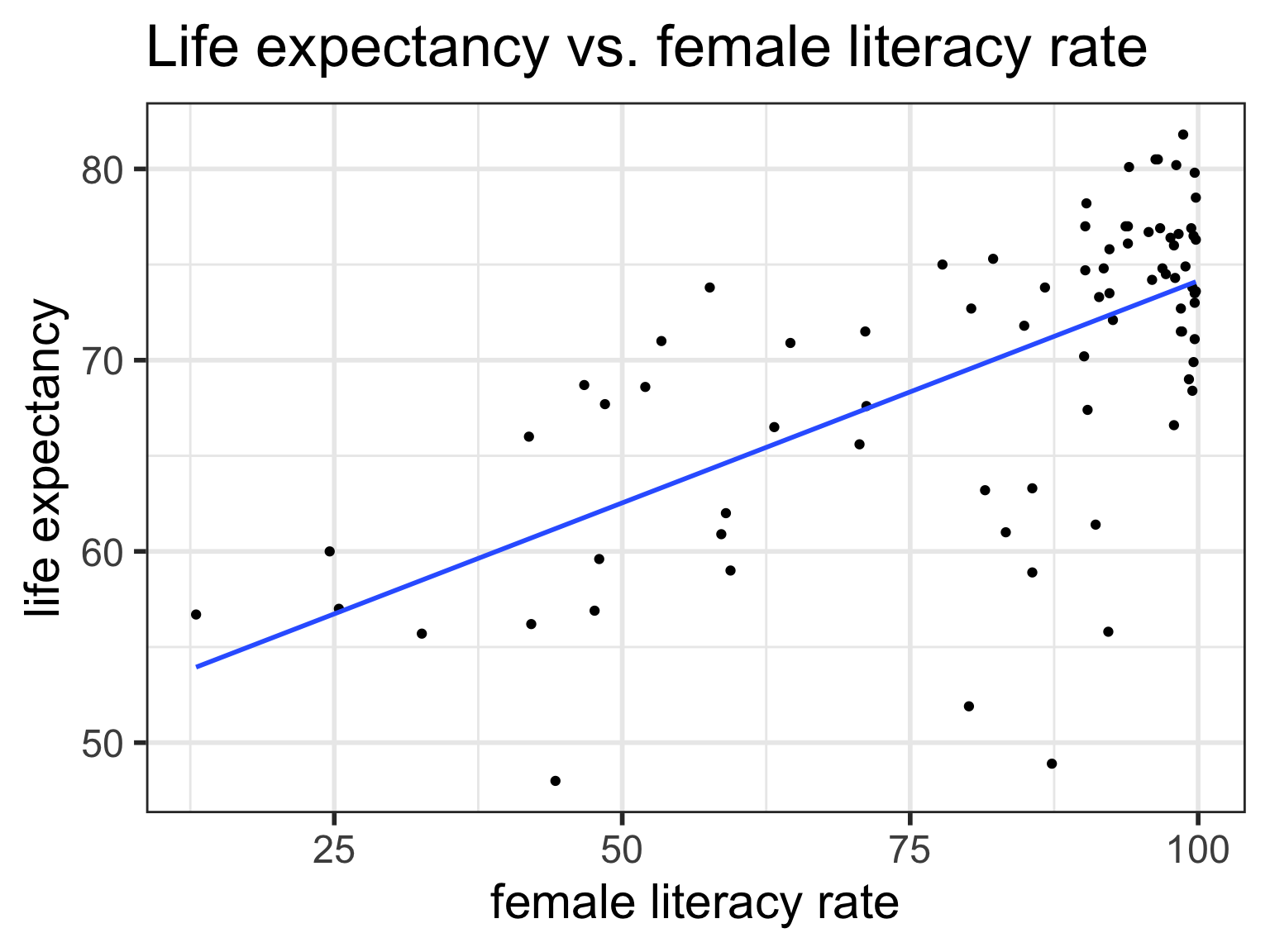
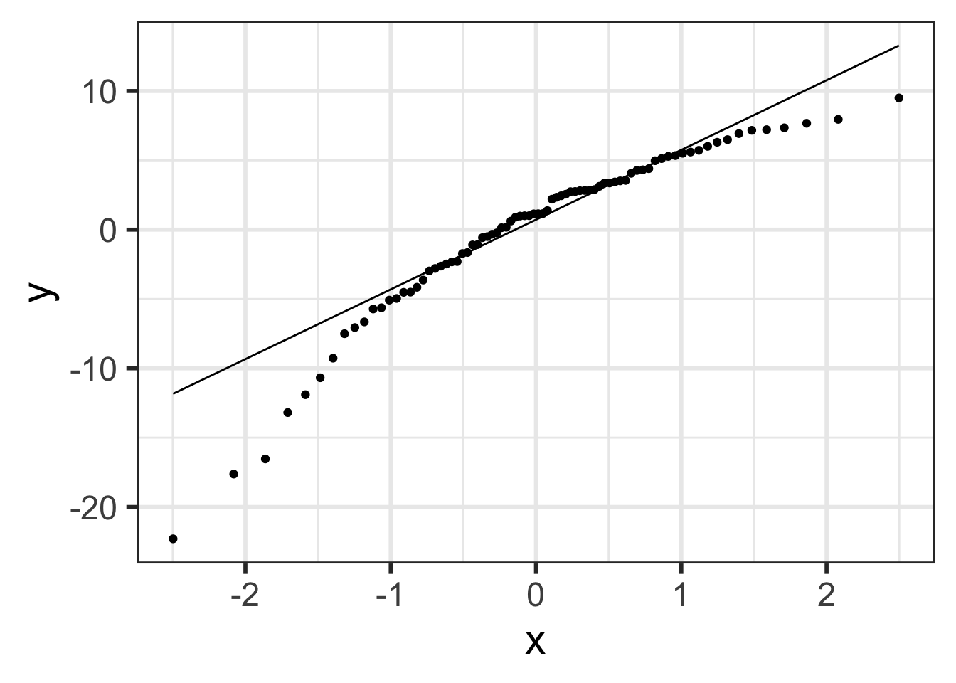
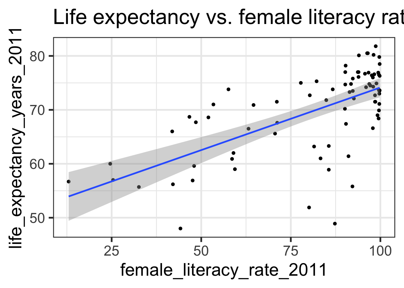
Regression line = best-fit line
\[\widehat{y} = b_0 + b_1 \cdot x \]
\(\hat{y}\) is the predicted outcome for a specific value of \(x\) .\(b_0\) is the intercept\(b_1\) is the slope of the line, i.e., the increase in \(\hat{y}\) for every increase of one (unit increase) in \(x\) .
`geom_smooth()` using formula = 'y ~ x'
Intercept
The expected outcome for the \(y\) -variable when the \(x\) -variable is 0.
Slope
For every increase of 1 unit in the \(x\) -variable, there is an expected increase of, on average, \(b_1\) units in the \(y\) -variable.
We only say that there is an expected increase and not necessarily a causal increase.
Regression in R: lm(), summary(), & tidy()
<- lm (life_expectancy_years_2011 ~ female_literacy_rate_2011,data = gapm)summary (model1)
Call:
lm(formula = life_expectancy_years_2011 ~ female_literacy_rate_2011,
    data = gapm)

Residuals:
    Min      1Q  Median      3Q     Max
-22.299  -2.670   1.145   4.114   9.498

Coefficients:
                          Estimate Std. Error t value Pr(>|t|)
(Intercept)               50.92790    2.66041  19.143  < 2e-16 ***
female_literacy_rate_2011  0.23220    0.03148   7.377  1.5e-10 ***
---
Signif. codes:  0 '***' 0.001 '**' 0.01 '*' 0.05 '.' 0.1 ' ' 1

Residual standard error: 6.142 on 78 degrees of freedom
Multiple R-squared:  0.4109,    Adjusted R-squared:  0.4034
F-statistic: 54.41 on 1 and 78 DF,  p-value: 1.501e-10
term
estimate
std.error
statistic
p.value
(Intercept)
50.9278981
2.66040695
19.142898
3.325312e-31 female_literacy_rate_2011
0.2321951
0.03147744
7.376557
1.501286e-10
Regression equation for our model:
\[\widehat{\textrm{life expectancy}} = 50.9 + 0.232 \cdot \textrm{female literacy rate} \]
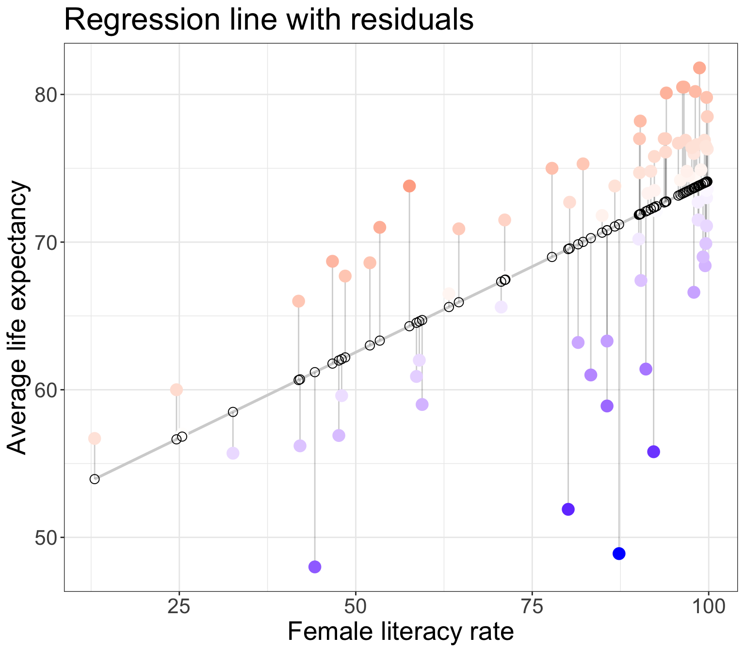
Residuals
Observed values \(y_i\)
the values in the dataset
Fitted values \(\widehat{y}_i\)
the values that fall on the best-fit line for a specific \(x_i\)
Residuals \(e_i = y_i - \widehat{y}_i\)
the differences between the observed and fitted values
`geom_smooth()` using formula = 'y ~ x'
The (population) regresison model
The (population) regression model is denoted by
\[Y = \beta_0 + \beta_1 \cdot X + \epsilon\]
\(\beta_0\) and \(\beta_1\) are unknown population parameters\(\epsilon\) (epsilon) is the error about the line
It is assumed to be a random variable:
\(\epsilon \sim N(0, \sigma^2)\) variance \(\sigma^2\) is constant
The line \(Y\) given a value of \(x\) : \(E(Y|x)\)
The point estimates for \(\beta_0\) and \(\beta_1\) based on a sample are denoted by \(b_0, b_1, s_{residuals}^2\)
Note: also common notation is \(\widehat{\beta}_0, \widehat{\beta}_1, \widehat{\sigma}^2\)
What are the LINE conditions?
For “good” model fit and to be able to make inferences and predictions based on our models, 4 conditions need to be satisfied.
Briefly:
L inearity of relationship between variablesI ndependence of the Y valuesN ormality of the residualsE quality of variance of the residuals (homoscedasticity)
More in depth :
L : there is a linear relationship between the mean response (Y) and the explanatory variable (X),I : the errors are independent—there’s no connection between how far any two points lie from the regression line,N : the responses are normally distributed at each level of X, andE : the variance or, equivalently, the standard deviation of the responses is equal for all levels of X.
L: Linearity of relationship between variables
Is the association between the variables linear?
Diagnostic tools:
Scatterplot
Residual plot (see later section for E : Equality of variance of the residuals)
`geom_smooth()` using formula = 'y ~ x'
`geom_smooth()` using method = 'loess' and formula = 'y ~ x'
I: Independence of the residuals (\(Y\) values)
Are the data points independent of each other?
Examples of when they are not independent, include
repeated measures (such as baseline, 3 months, 6 months)
data from clusters, such as different hospitals or families
This condition is checked by reviewing the study design and not by inspecting the data
How to analyze data using regression models when the \(Y\) -values are not independent is covered in BSTA 519 (Longitudinal data)
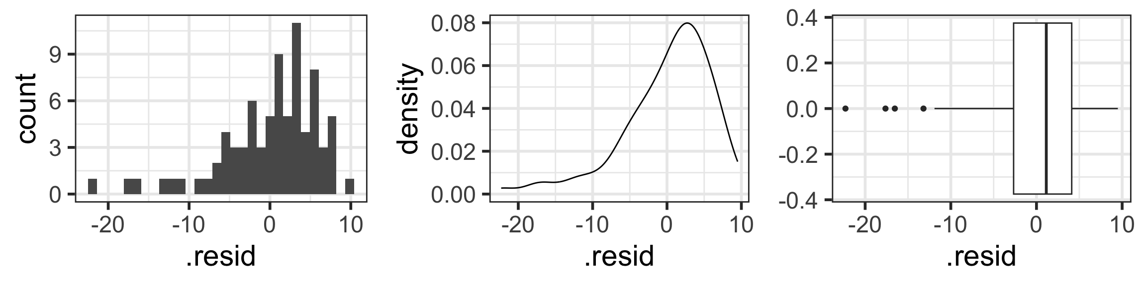
N: Normality of the residuals
Extract residuals from regression model in R
Diagnostic tools:
Distribution plots of residuals
QQ plots
N: Normality of the residuals
The responses Y are normally distributed at each level of x
Check normality with “usual” distribution plots
Note that below I save each figure, and then combine them together in one row of output using grid.arrange() from the gridExtra package.
<- ggplot (aug1, aes (x = .resid)) + geom_histogram ()<- ggplot (aug1, aes (x = .resid)) + geom_density ()<- ggplot (aug1, aes (x = .resid)) + geom_boxplot ()library (gridExtra) # NEW!!! grid.arrange (hist1, density1, box1, nrow = 1 )
`stat_bin()` using `bins = 30`. Pick better value with `binwidth`.
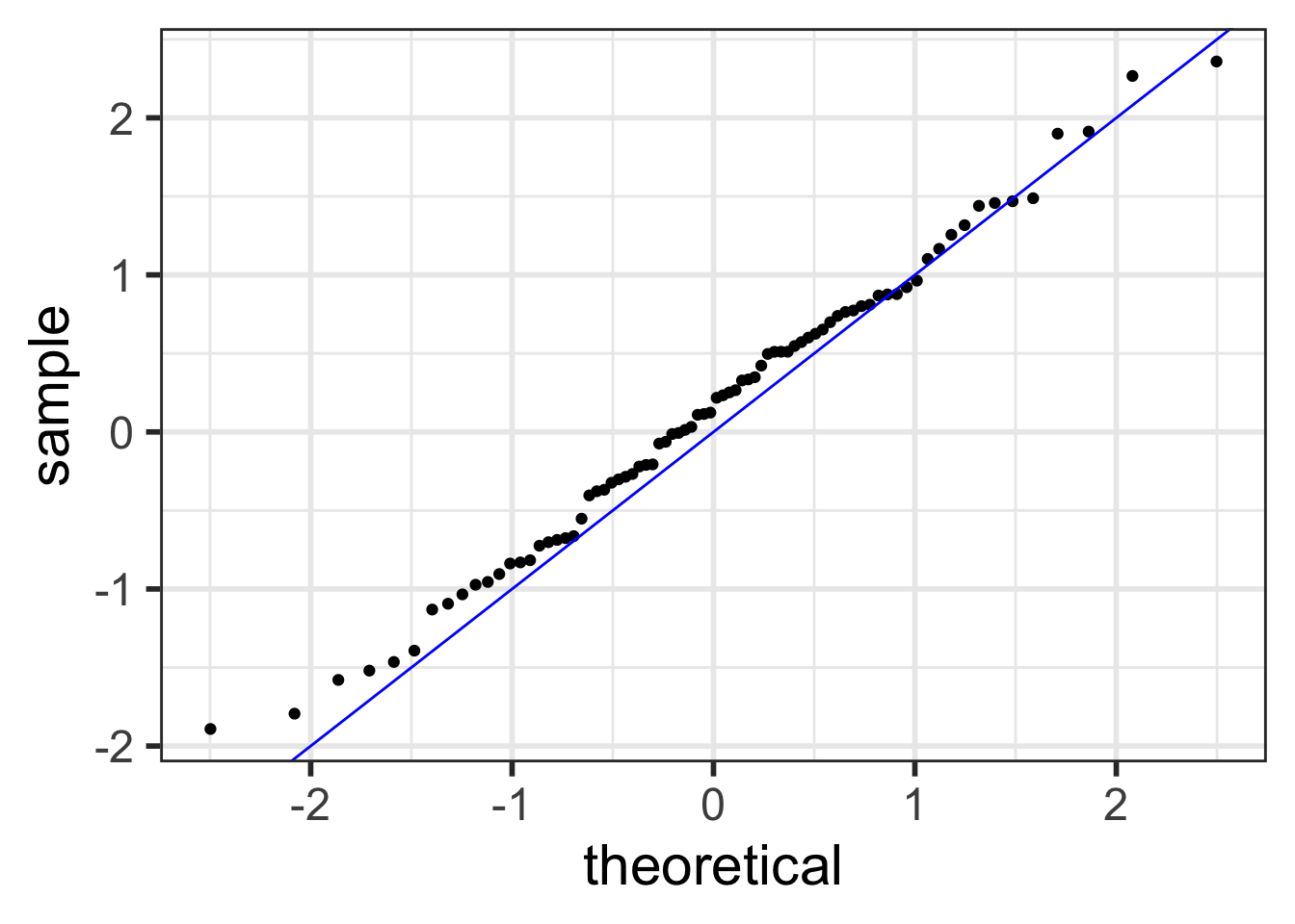
Normal QQ plots (QQ = quantile-quantile)
It can be tricky to eyeball with a histogram or density plot whether the residuals are normal or not
QQ plots are often used to help with this
Vertical axis : data quantiles
data points are sorted in order and
assigned quantiles based on how many data points there are
Horizontal axis : theoretical quantiles
mean and standard deviation (SD) calculated from the data points
theoretical quantiles are calculated for each point, assuming the data are modeled by a normal distribution with the mean and SD of the data
Data are approximately normal if points fall on a line.
See more info at https://data.library.virginia.edu/understanding-QQ-plots/
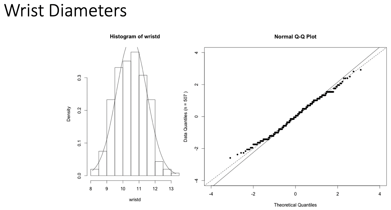
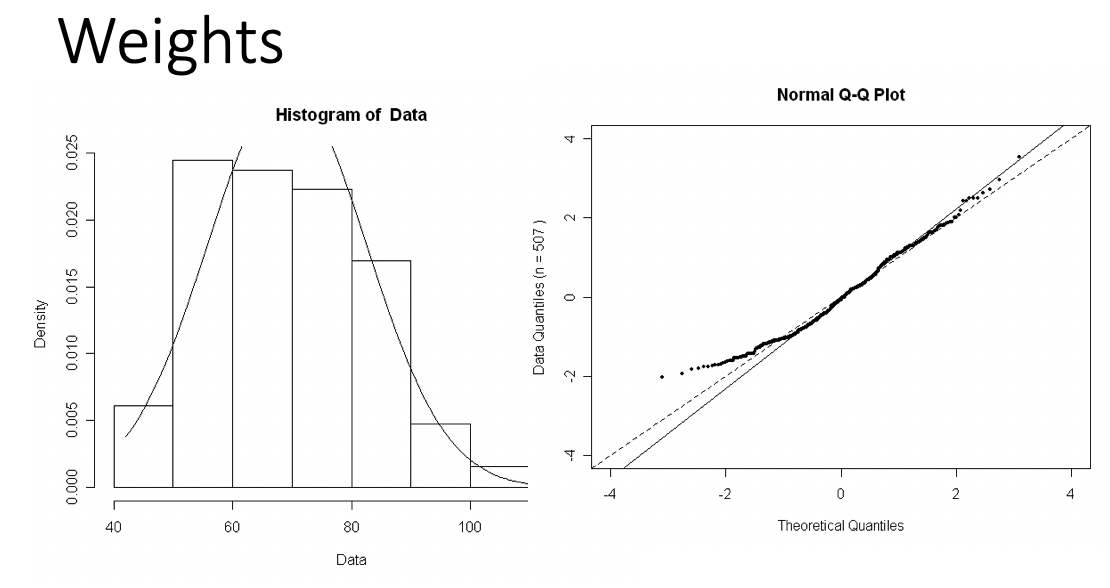
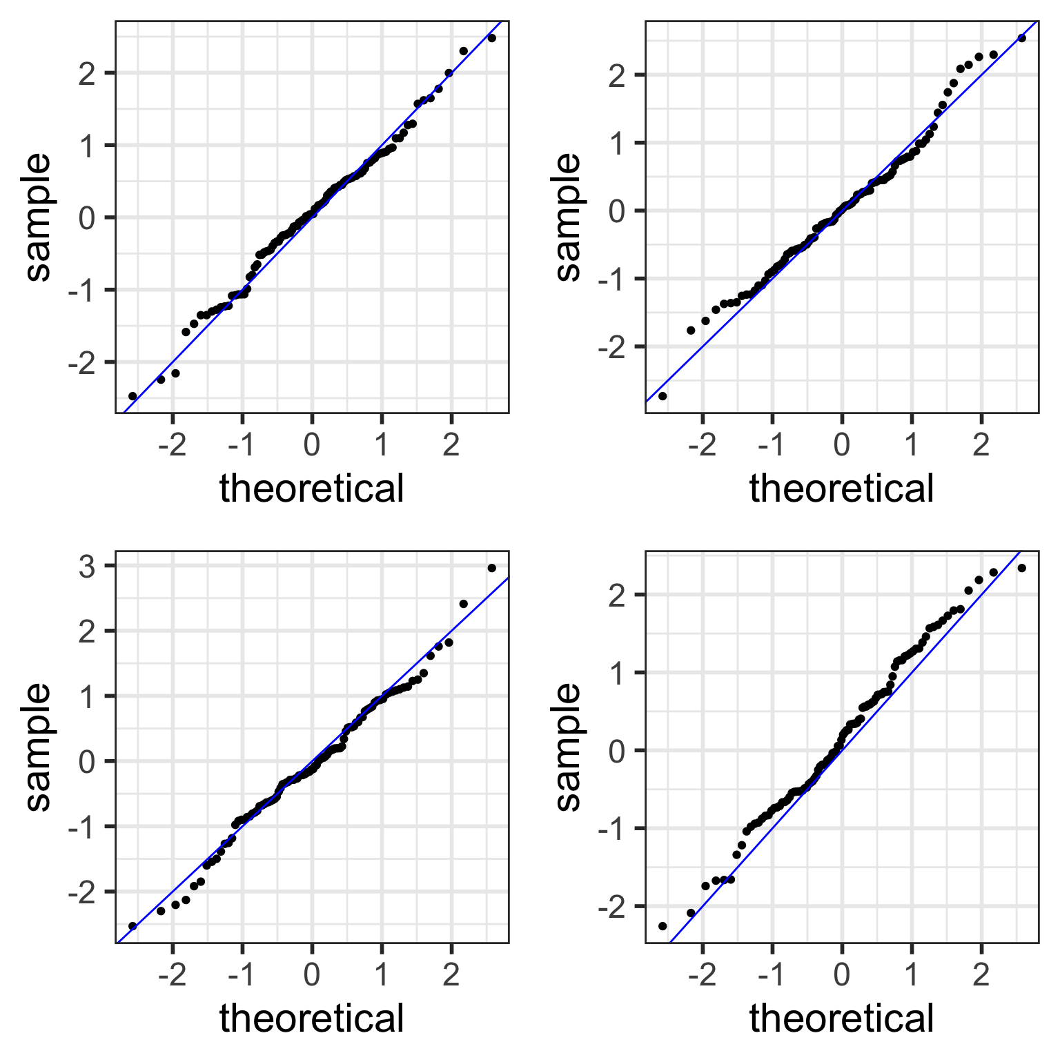
Examples of Normal QQ plots (1/5)
Data :
Body measurements from 507 physically active individuals
in their 20’s or early 30’s
within normal weight range.
Examples of Normal QQ plots (2/5)
Skewed right distribution
Examples of Normal QQ plots (3/5)
Long tails in distribution
Examples of Normal QQ plots (4/5)
Bimodal distribution
Examples of Normal QQ plots (5/5)
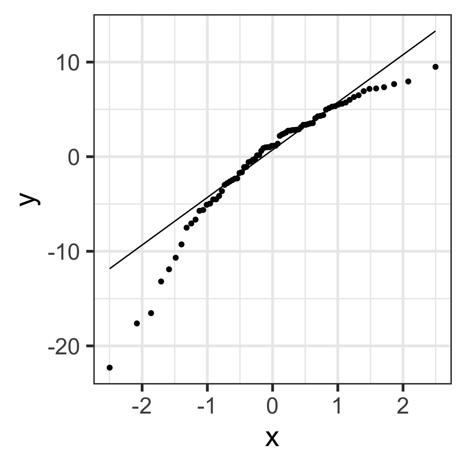
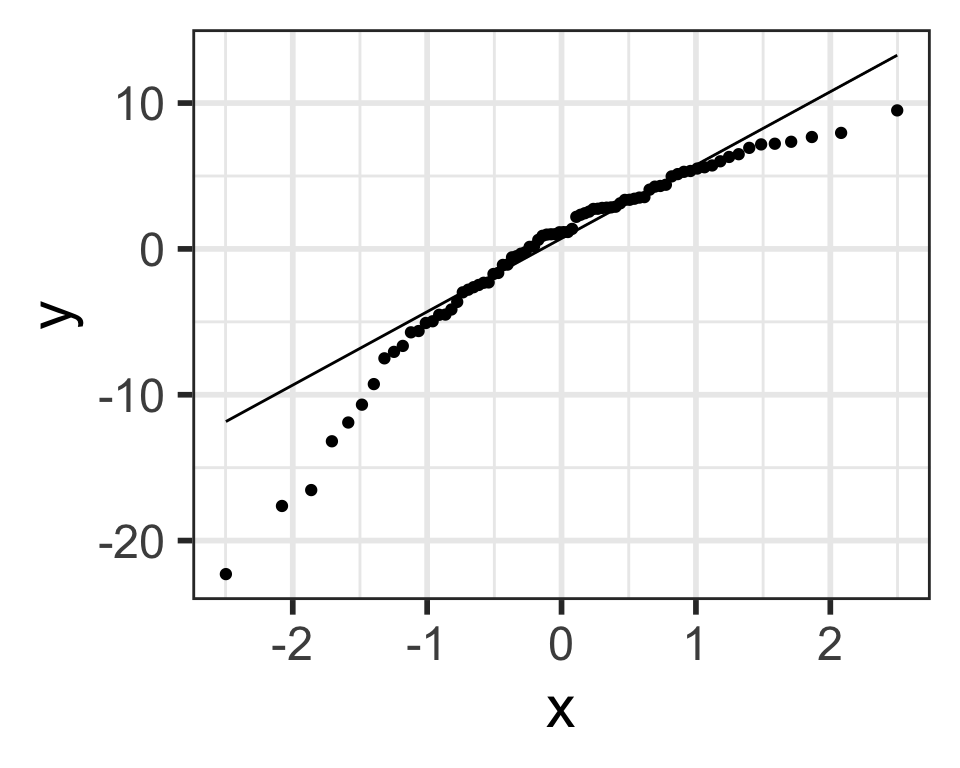
QQ plot of residuals of model1
`stat_bin()` using `bins = 30`. Pick better value with `binwidth`.
ggplot (aug1, aes (sample = .resid)) + stat_qq () + # points stat_qq_line () # line
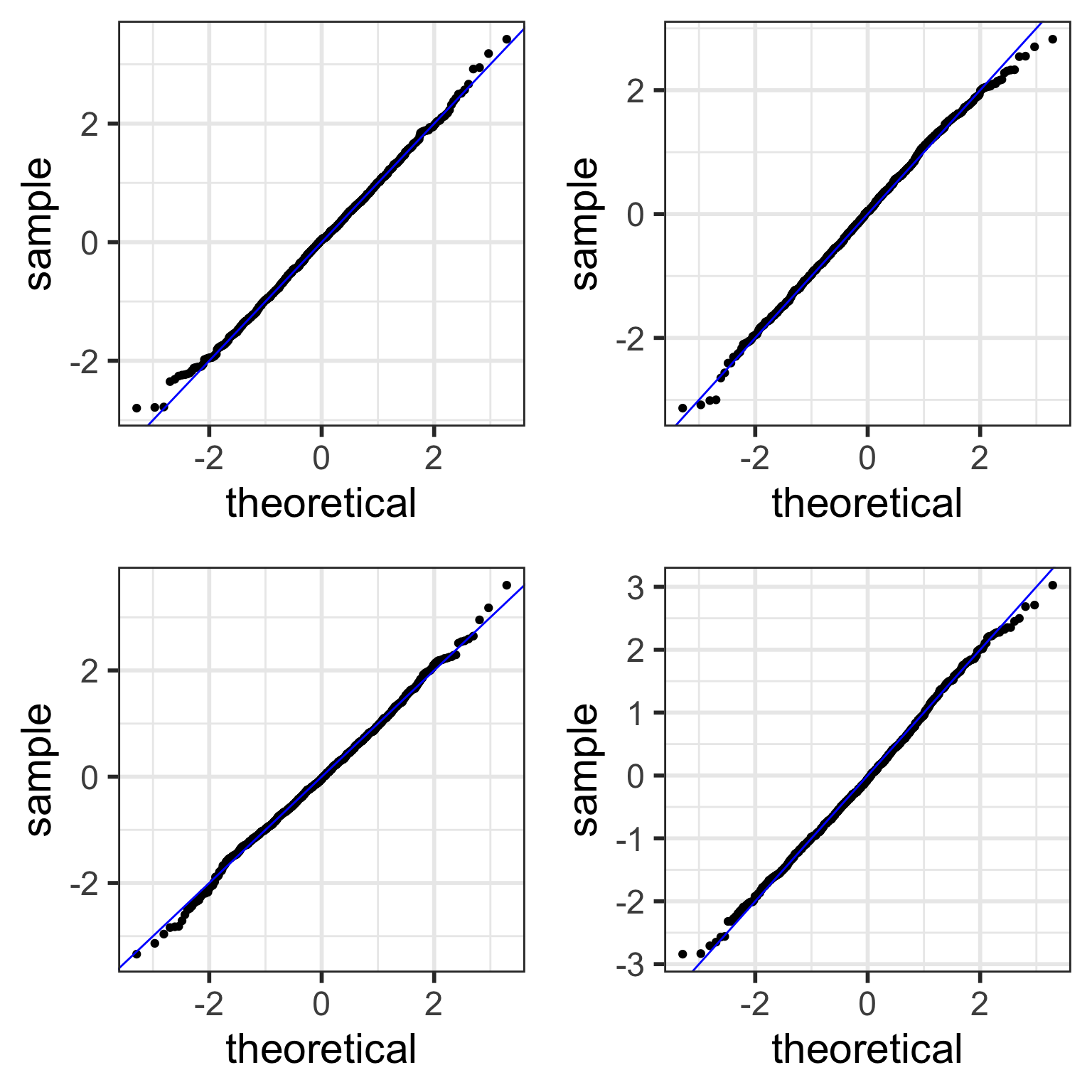
Compare to randomly generated Normal QQ plots
How “good ” we can expect a QQ plot to look depends on the sample size.
The QQ plots on the next slides are randomly generated
using random samples from actual standard normal distributions \(N(0,1)\) .
Thus, all the points in the QQ plots should theoretically fall in a line
However, there is sampling variability…
Randomly generated Normal QQ plots: n=100
Note that stat_qq_line() doesn’t work with randomly generated samples, and thus the code below manually creates the line that the points should be on (which is \(y=x\) in this case.)
<- 100 <- ggplot () + stat_qq (aes (sample = rnorm (samplesize))) + # line y=x geom_abline (intercept = 0 , slope = 1 , color = "blue" ) <- ggplot () + stat_qq (aes (sample = rnorm (samplesize))) + geom_abline (intercept = 0 , slope = 1 , color = "blue" )<- ggplot () + stat_qq (aes (sample = rnorm (samplesize))) + geom_abline (intercept = 0 , slope = 1 , color = "blue" )<- ggplot () + stat_qq (aes (sample = rnorm (samplesize))) + geom_abline (intercept = 0 , slope = 1 , color = "blue" )
grid.arrange (rand_qq1, rand_qq2, ncol = 2 )
Examples of simulated Normal QQ plots: n=10
With fewer data points,
simulated QQ plots are more likely to look “less normal”
even though the data points were sampled from normal distributions.
<- 10 # only change made to code! <- ggplot () + stat_qq (aes (sample = rnorm (samplesize))) + # line y=x geom_abline (intercept = 0 , slope = 1 , color = "blue" ) <- ggplot () + stat_qq (aes (sample = rnorm (samplesize))) + geom_abline (intercept = 0 , slope = 1 , color = "blue" )<- ggplot () + stat_qq (aes (sample = rnorm (samplesize))) + geom_abline (intercept = 0 , slope = 1 , color = "blue" )<- ggplot () + stat_qq (aes (sample = rnorm (samplesize))) + geom_abline (intercept = 0 , slope = 1 , color = "blue" )
grid.arrange (rand_qq1, rand_qq2, ncol = 2 )
Examples of simulated Normal QQ plots: n=1,000
With more data points,
simulated QQ plots are more likely to look “more normal”
<- 1000 # only change made to code! <- ggplot () + stat_qq (aes (sample = rnorm (samplesize))) + # line y=x geom_abline (intercept = 0 , slope = 1 , color = "blue" ) <- ggplot () + stat_qq (aes (sample = rnorm (samplesize))) + geom_abline (intercept = 0 , slope = 1 , color = "blue" )<- ggplot () + stat_qq (aes (sample = rnorm (samplesize))) + geom_abline (intercept = 0 , slope = 1 , color = "blue" )<- ggplot () + stat_qq (aes (sample = rnorm (samplesize))) + geom_abline (intercept = 0 , slope = 1 , color = "blue" )
grid.arrange (rand_qq1, rand_qq2, ncol = 2 )
Back to our example
Residuals from Life Expectancy vs. Female Literacy Rate Regression
ggplot (aug1, aes (sample = .resid)) + stat_qq () + stat_qq_line ()
Simulated QQ plot of Normal Residuals with n = 80
# number of observations # in fitted model nobs (model1)
ggplot () + stat_qq (aes (sample = rnorm (80 ))) + geom_abline (intercept = 0 , slope = 1 , color = "blue" )
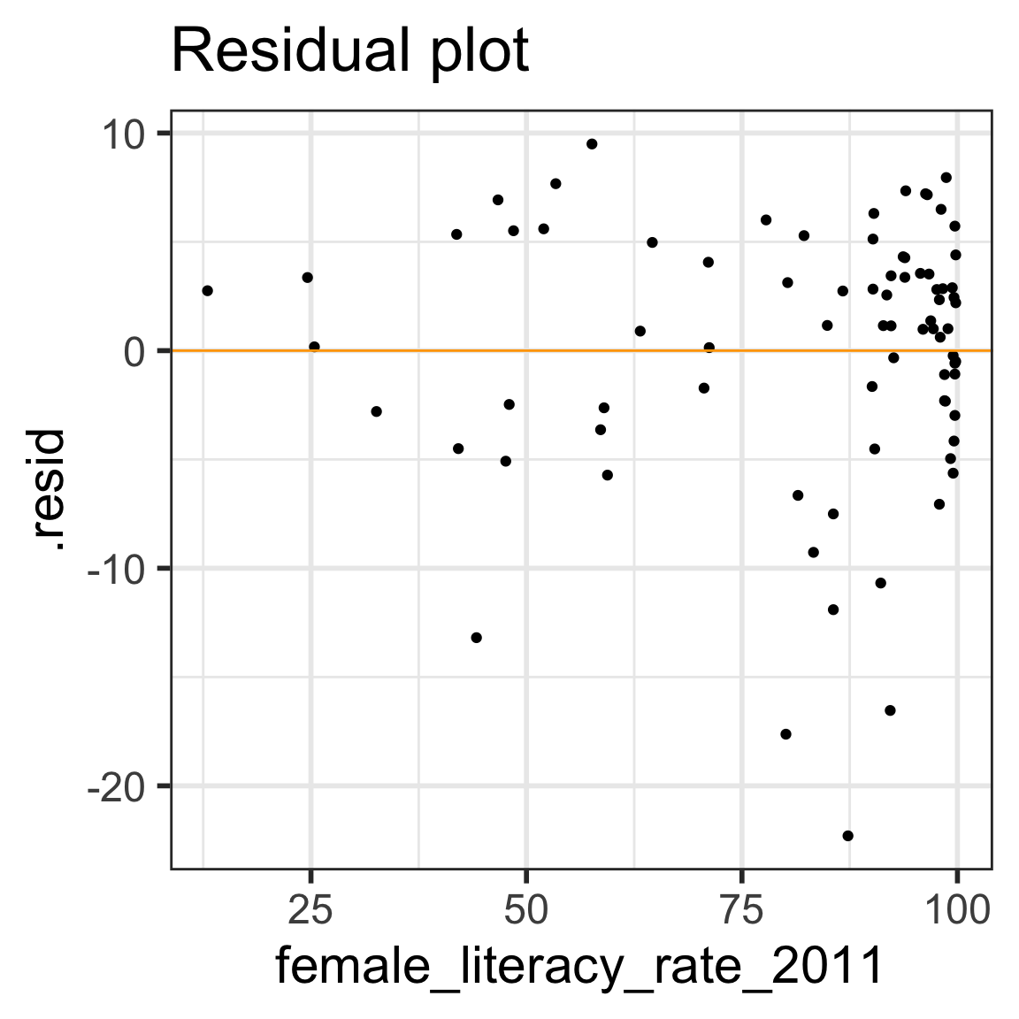
E: Equality of variance of the residuals
Homoscedasticity
Diagnostic tool: residual plot
Residual plot
\(x\) = explanatory variable from regression model
(or the fitted values for a multiple regression)
\(y\) = residuals from regression model
[1] "life_expectancy_years_2011" "female_literacy_rate_2011"
[3] ".fitted"                    ".resid"
[5] ".hat"                       ".sigma"
[7] ".cooksd"                    ".std.resid"
ggplot (aug1, aes (x = female_literacy_rate_2011, y = .resid)) + geom_point () + geom_abline (intercept = 0 , slope = 0 , color = "orange" ) + labs (title = "Residual plot" )
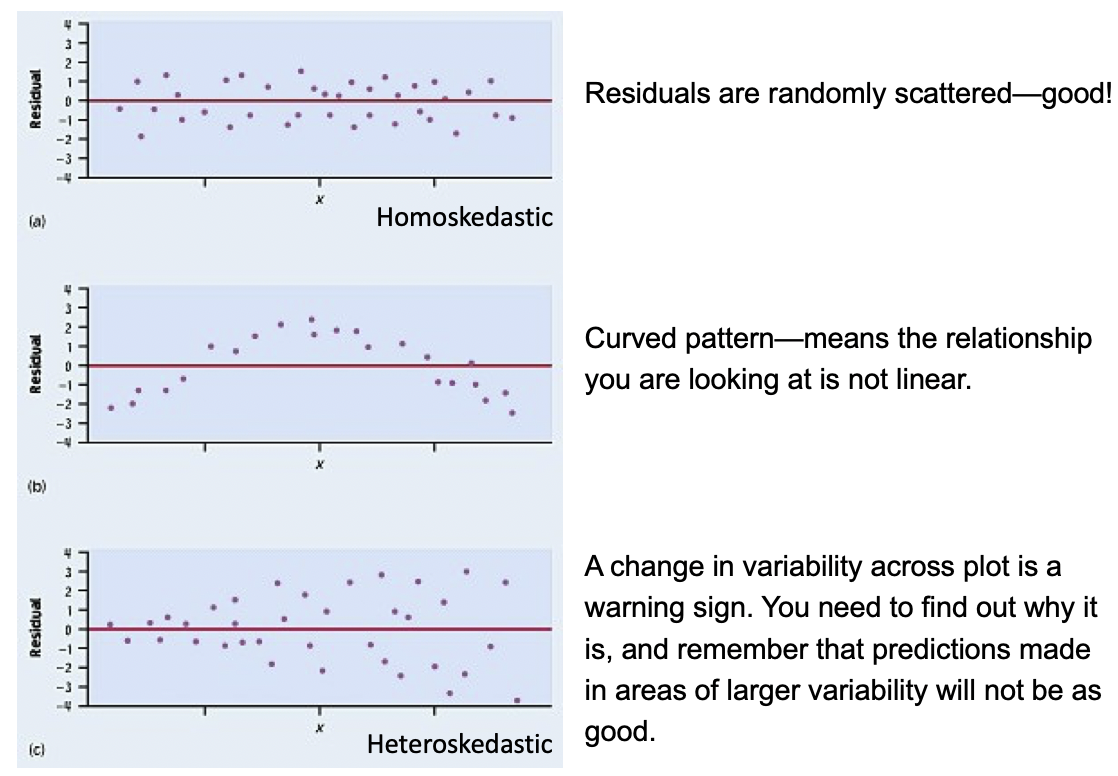
E: Equality of variance of the residuals (Homoscedasticity)
The variance or, equivalently, the standard deviation of the responses is equal for all values of x .
This is called homoskedasticity (top row)
If there is heteroskedasticity (bottom row), then the assumption is not met.
\(R^2\) = Coefficient of determinationAnother way to assess model fit
\(R^2\) = Coefficient of determination (1/2)
Recall that the correlation coefficient \(r\) measures the strength of the linear relationship between two numerical variables
\(R^2\) is usually used to measure the strength of a linear fit
For a simple linear regression model (one numerical predictor), \(R^2\) is just the square of the correlation coefficient
In general, \(R^2\) is the proportion of the variability of the dependent variable that is explained by the independent variable(s)
\[R^2 = \frac{\textrm{variance of predicted y-values}}
{\textrm{variance of observed y-values}} = \frac{\sum_{i=1}^n(\widehat{y}_i-\bar{y})^2}
{\sum_{i=1}^n(y_i-\bar{y})^2}
= \frac{s_y^2 - s_{\textrm{residuals}}^2}
{s_y^2}\] \[R^2 = 1- \frac{s_{\textrm{residuals}}^2}
{s_y^2}\] where \(\frac{s_{\textrm{residuals}}^2}{s_y^2}\) is the proportion of “unexplained” variability in the \(y\) values,\(R^2 = 1- \frac{s_{\textrm{residuls}}^2}{s_y^2}\) is the proportion of “explained” variability in the \(y\) values
\(R^2\) = Coefficient of determination (2/2)Calculating \(R^2\) in R using glance() from the broom package:
# A tibble: 1 × 12
  r.squared adj.r.squared sigma statistic  p.value    df logLik   AIC   BIC
      <dbl>         <dbl> <dbl>     <dbl>    <dbl> <dbl>  <dbl> <dbl> <dbl>
1     0.411         0.403  6.14      54.4 1.50e-10     1  -258.  521.  529.
# ℹ 3 more variables: deviance <dbl>, df.residual <int>, nobs <int>
A model can have a high \(R^2\) value when there is a curved pattern.
Always first check whether a linear model is reasonable or not.
\(R^2\) in summary() R output
Call:
lm(formula = life_expectancy_years_2011 ~ female_literacy_rate_2011,
    data = gapm)

Residuals:
    Min      1Q  Median      3Q     Max
-22.299  -2.670   1.145   4.114   9.498

Coefficients:
                          Estimate Std. Error t value Pr(>|t|)
(Intercept)               50.92790    2.66041  19.143  < 2e-16 ***
female_literacy_rate_2011  0.23220    0.03148   7.377  1.5e-10 ***
---
Signif. codes:  0 '***' 0.001 '**' 0.01 '*' 0.05 '.' 0.1 ' ' 1

Residual standard error: 6.142 on 78 degrees of freedom
Multiple R-squared:  0.4109,    Adjusted R-squared:  0.4034
F-statistic: 54.41 on 1 and 78 DF,  p-value: 1.501e-10
Compare to the square of the correlation coefficient \(r\) :
<- cor (x = gapm$ life_expectancy_years_2011, y = gapm$ female_literacy_rate_2011,use = "complete.obs" )
Regression inference
Inference for population slope \(\beta_1\)
CI for mean response \(\mu_{Y|x^*}\)
Prediction interval for predicting individual observations
Inference for population slope \(\beta_1\)
# Fit regression model: <- lm (life_expectancy_years_2011 ~ female_literacy_rate_2011,data = gapm)# Get regression table: tidy (model1, conf.int = TRUE ) %>% gt () # conf.int = TRUE part is new!
term
estimate
std.error
statistic
p.value
conf.low
conf.high
(Intercept)
50.9278981
2.66040695
19.142898
3.325312e-31
45.6314348
56.2243615 female_literacy_rate_2011
0.2321951
0.03147744
7.376557
1.501286e-10
0.1695284
0.2948619
\[\begin{align}
\widehat{y} =& b_0 + b_1 \cdot x\\
\widehat{\text{life expectancy}} =& 50.9 + 0.232 \cdot \text{female literacy rate}
\end{align}\]
What are \(H_0\) and \(H_A\) ?
How do we calculate the standard error, statistic, p -value, and CI?
We can also test & calculate CI for the population intercept
This will be covered in BSTA 512
Inference for the population slope
Population model line + random “noise”
\[Y = \beta_0 + \beta_1 \cdot X + \varepsilon\] with \(\varepsilon \sim N(0,\sigma)\) \(\sigma\) is the variability (SD) of the residuals
Sample best-fit (least-squares) line:
\[\widehat{y} = b_0 + b_1 \cdot x \]
Note: Some sources use \(\widehat{\beta}\) instead of \(b\) .
Construct a 95% confidence interval for the population slope \(\beta_1\)
Conduct the hypothesis test
\[\begin{align}
H_0 &: \beta_1 = 0\\
\text{vs. } H_A&: \beta_1 \neq 0
\end{align}\]
Note: R reports p-values for 2-sided tests
CI for population slope \(\beta_1\)
Recall the general CI formula:
\[\textrm{Point Estimate} \pm t^*\cdot SE_{\textrm{Point Estimate}}\]
For the CI of the coefficient \(b_1\) this translates to
\[b_1 \pm t^*\cdot SE_{b_1}\] where \(t^*\) is the critical value from a \(t\) -distribution with \(df = n -2\) .
How is \(\text{SE}_{b_1}\) calculated? See next slide.
tidy (model1, conf.int = TRUE )
# A tibble: 2 × 7
  term                  estimate std.error statistic  p.value conf.low conf.high
  <chr>                    <dbl>     <dbl>     <dbl>    <dbl>    <dbl>     <dbl>
1 (Intercept)             50.9      2.66       19.1  3.33e-31   45.6      56.2
2 female_literacy_rate…    0.232    0.0315      7.38 1.50e-10    0.170     0.295
Standard error of fitted slope \(b_1\)
\[\text{SE}_{b_1} = \frac{s_{\textrm{residuals}}}{s_x\sqrt{n-1}}\]
\(\text{SE}_{b_1}\) is the variability of the statistic \(b_1\)
\(s_{\textrm{residuals}}\) is the sd of the residuals
\(s_x\) is the sample sd of the explanatory variable \(x\)
\(n\) is the sample size, or the number of (complete) pairs of points
# A tibble: 1 × 12
  r.squared adj.r.squared sigma statistic  p.value    df logLik   AIC   BIC
      <dbl>         <dbl> <dbl>     <dbl>    <dbl> <dbl>  <dbl> <dbl> <dbl>
1     0.411         0.403  6.14      54.4 1.50e-10     1  -258.  521.  529.
# ℹ 3 more variables: deviance <dbl>, df.residual <int>, nobs <int>
# standard deviation of the residuals (Residual standard error in summary() output) <- glance (model1)$ sigma)# standard deviation of x's <- sd (gapm$ female_literacy_rate_2011))# number of pairs of complete observations <- nobs (model1))<- s_resid/ (s_x * sqrt (n-1 ))) # compare to SE in regression output
Calculate CI for population slope \(\beta_1\)
\[b_1 \pm t^*\cdot SE_{b_1}\]
where \(t^*\) is the \(t\) -distribution critical value with \(df = n -2\) .
tidy (model1, conf.int = TRUE ) %>% gt ()
term
estimate
std.error
statistic
p.value
conf.low
conf.high
(Intercept)
50.9278981
2.66040695
19.142898
3.325312e-31
45.6314348
56.2243615 female_literacy_rate_2011
0.2321951
0.03147744
7.376557
1.501286e-10
0.1695284
0.2948619
Save regression output for the row with the slope’s information:
<- tidy (model1) %>% filter (term == "female_literacy_rate_2011" )%>% gt ()
term
estimate
std.error
statistic
p.value
female_literacy_rate_2011
0.2321951
0.03147744
7.376557
1.501286e-10
Save values needed for CI:
<- model1_b1$ estimate<- model1_b1$ std.error
nobs (model1) # sample size n <- qt (.975 , df = 80-2 ))
Compare CI bounds below with the ones in the regression table above.
<- b1 - tstar* SE_b1)<- b1 + tstar* SE_b1)
Hypothesis test for population slope \(\beta_1\)
\[\begin{align}
H_0 &: \beta_1 = 0\\
\text{vs. } H_A&: \beta_1 \neq 0
\end{align}\]
The test statistic for \(b_1\) is
\[t = \frac{ b_1 - \beta_1}{ \text{SE}_{b_1}} = \frac{ b_1}{ \text{SE}_{b_1}}\]
when we assume \(H_0: \beta_1 = 0\) is true.
tidy (model1, conf.int = TRUE ) %>% gt ()
term
estimate
std.error
statistic
p.value
conf.low
conf.high
(Intercept)
50.9278981
2.66040695
19.142898
3.325312e-31
45.6314348
56.2243615 female_literacy_rate_2011
0.2321951
0.03147744
7.376557
1.501286e-10
0.1695284
0.2948619
Calculate the test statistic using the values in the regression table:
# recall model1_b1 is regression table restricted to b1 row <- model1_b1$ estimate / model1_b1$ std.error)
Compare this test statistic value to the one from the regression table above
\(p\) -value for testing population slope \(\beta_1\)
As usual, the \(p\) -value is the probability of obtaining a test statistic just as extreme or more extreme than the observed test statistic assuming the null hypothesis \(H_0\) is true.
To calculate the \(p\) -value, we need to know the probability distribution of the test statistic (the null distribution ) assuming \(H_0\) is true.
Statistical theory tells us that the test statistic \(t\) can be modeled by a \(t\) -distribution\(df = n-2\)
Recall that this is a 2-sided test:
pv = 2 * pt (TestStat, df= 80-2 , lower.tail= F))
Compare the \(p\) -value to the one from the regression table below
tidy (model1, conf.int = TRUE ) %>% gt () # compare p-value calculated above to p-value in table
term
estimate
std.error
statistic
p.value
conf.low
conf.high
(Intercept)
50.9278981
2.66040695
19.142898
3.325312e-31
45.6314348
56.2243615 female_literacy_rate_2011
0.2321951
0.03147744
7.376557
1.501286e-10
0.1695284
0.2948619
Prediction (& inference)
Prediction for mean response
Prediction for new individual observation
Prediction with regression line
term
estimate
std.error
statistic
p.value
(Intercept)
50.9278981
2.66040695
19.142898
3.325312e-31 female_literacy_rate_2011
0.2321951
0.03147744
7.376557
1.501286e-10
\[\widehat{\textrm{life expectancy}} = 50.9 + 0.232 \cdot \textrm{female literacy rate} \]
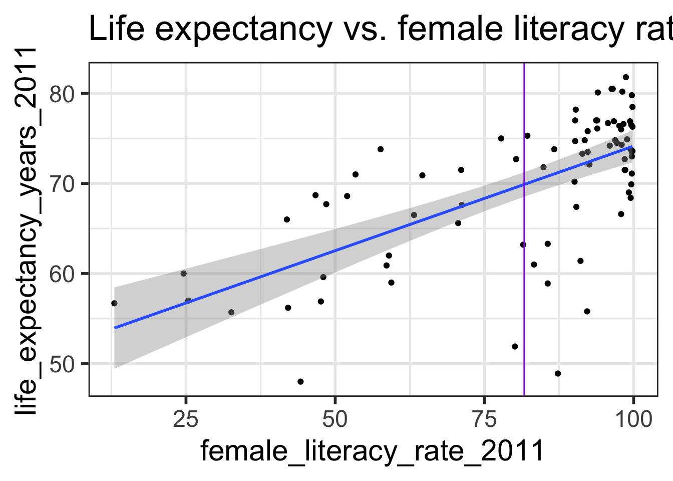
What is the predicted life expectancy for a country with female literacy rate 60%?
\[\widehat{\textrm{life expectancy}} = 50.9 + 0.232 \cdot 60 = 64.82\]
<- 50.9 + 0.232 * 60 )
How do we interpret the predicted value?
How variable is it?
Prediction with regression line
Recall the population model:
line + random “noise”
\[Y = \beta_0 + \beta_1 \cdot X + \varepsilon\] with \(\varepsilon \sim N(0,\sigma)\) \(\sigma\) is the variability (SD) of the residuals
When we take the expected value, at a given value \(x^*\) , we have that the predicted response is the average expected response at \(x^*\) :
\[\widehat{E[Y|x^*]} = b_0 + b_1 x^*\]
`geom_smooth()` using formula = 'y ~ x'
These are the points on the regression line.
The mean responses has variability, and we can calculate a CI for it, for every value of \(x^*\) .
CI for mean response \(\mu_{Y|x^*}\)
\[\widehat{E[Y|x^*]} \pm t_{n-2}^* \cdot SE_{\widehat{E[Y|x^*]}}\]
\(SE_{\widehat{E[Y|x^*]}}\) is calculated using
\[SE_{\widehat{E[Y|x^*]}} = s_{residuals} \sqrt{\frac{1}{n} + \frac{(x^* - \bar{x})^2}{(n-1)s_x^2}}\]
\(\widehat{E[Y|x^*]}\) is the predicted value at the specified point \(x^*\) of the explanatory variable\(s_{\textrm{residuals}}^2\) is the sd of the residuals\(n\) is the sample size, or the number of (complete) pairs of points\(\bar{x}\) is the sample mean of the explanatory variable \(x\) \(s_x\) is the sample sd of the explanatory variable \(x\)
Recall that \(t_{n-2}^*\) is calculated using qt() and depends on the confidence level.
Example: CI for mean response \(\mu_{Y|x^*}\)
Find the 95% CI for the mean life expectancy when the female literacy rate is 60.
\[\begin{align}
\widehat{E[Y|x^*]} &\pm t_{n-2}^* \cdot SE_{\widehat{E[Y|x^*]}}\\
64.8596 &\pm 1.990847 \cdot s_{residuals} \sqrt{\frac{1}{n} + \frac{(x^* - \bar{x})^2}{(n-1)s_x^2}}\\
64.8596 &\pm 1.990847 \cdot 6.142157 \sqrt{\frac{1}{80} + \frac{(60 - 81.65375)^2}{(80-1)21.95371^2}}\\
64.8596 &\pm 1.990847 \cdot 0.9675541\\
64.8596 &\pm 1.926252\\
(62.93335 &, 66.78586)
\end{align}\]
<- 50.9278981 + 0.2321951 * 60 )<- qt (.975 , df = 78 ))<- glance (model1)$ sigma)
<- mean (gapm$ female_literacy_rate_2011))<- sd (gapm$ female_literacy_rate_2011))
<- s_resid * sqrt (1 / n + (60 - mx)^ 2 / ((n-1 )* s_x^ 2 )))
Example: Using R for CI for mean response \(\mu_{Y|x^*}\)
Find the 95% CI’s for the mean life expectancy when the female literacy rate is 40, 60, and 80.
Use the base R predict() function
Requires specification of a newdata “value”
The newdata value is \(x^*\)
This has to be in the format of a data frame though
with column name identical to the predictor variable in the model
<- data.frame (female_literacy_rate_2011 = c (40 , 60 , 80 ))
  female_literacy_rate_2011
1                        40
2                        60
3                        80
predict (model1, newdata= newdata, interval= "confidence" )
       fit      lwr      upr
1 60.21570 57.26905 63.16236
2 64.85961 62.93335 66.78586
3 69.50351 68.13244 70.87457
Interpretation
We are 95% confident that the average life expectancy for a country with a 60% female literacy rate will be between 62.9 and 66.8 years.
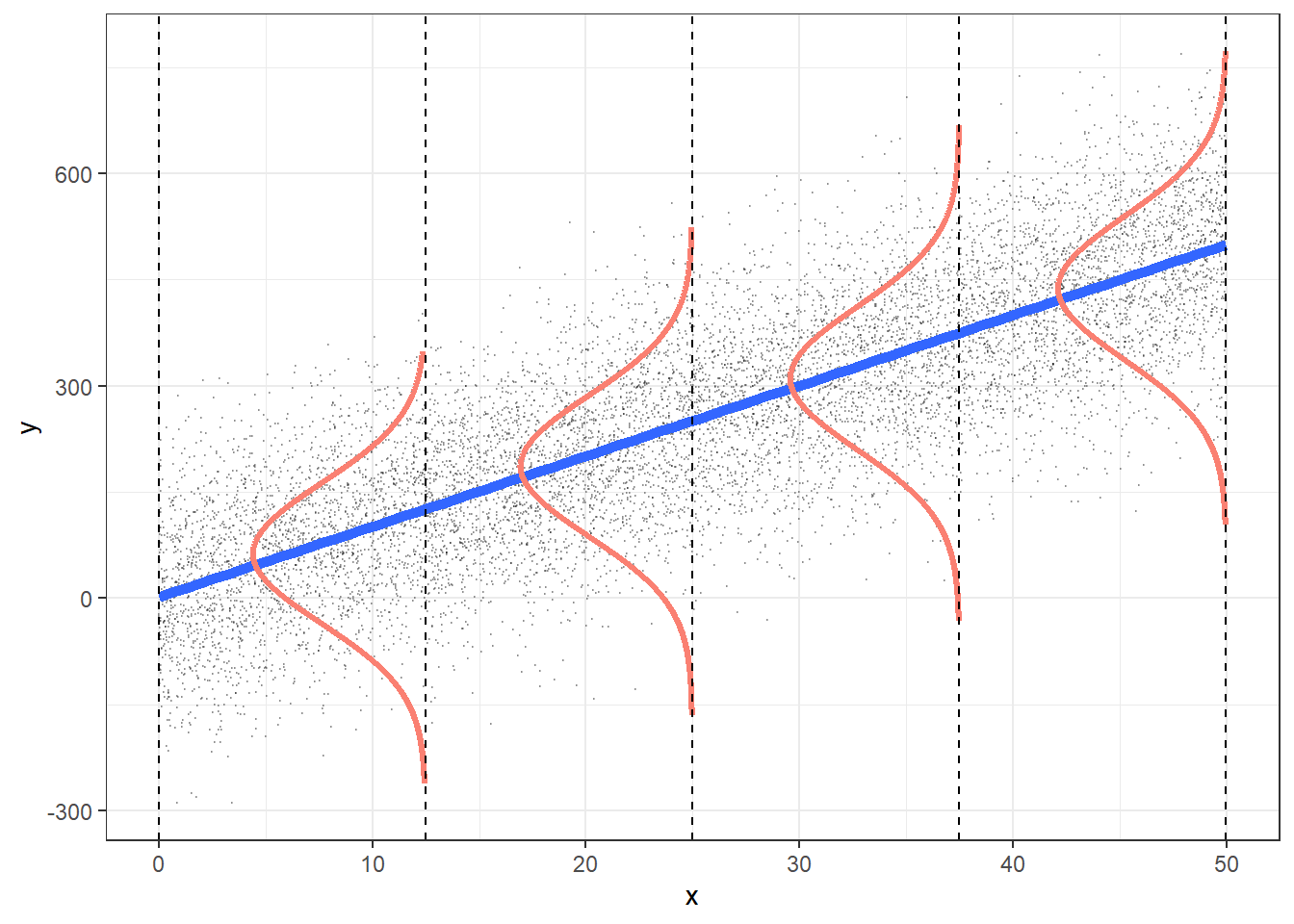
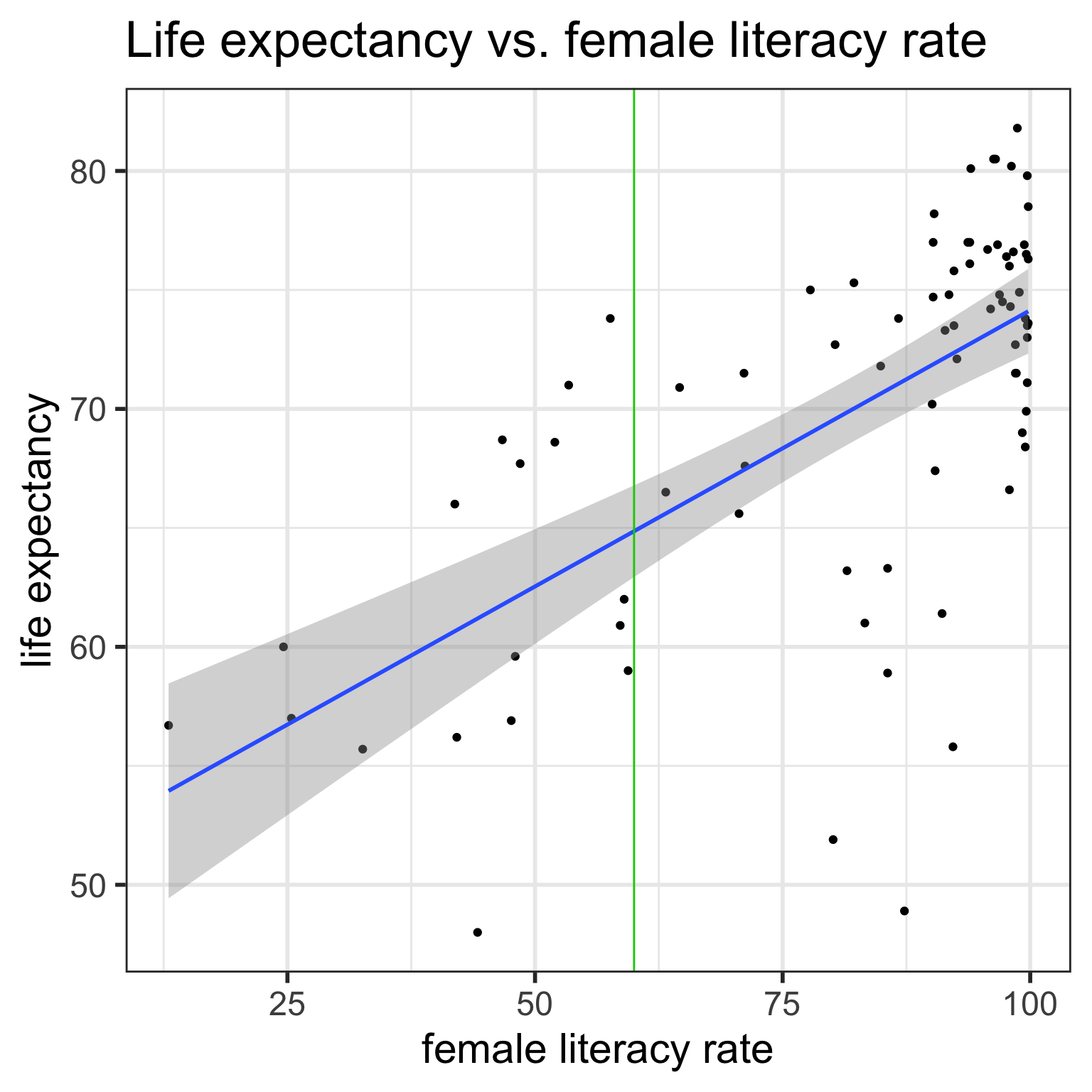
Confidence bands for mean response \(\mu_{Y|x^*}\)
Often we plot the CI for many values of X, creating confidence bands
The confidence bands are what ggplot creates when we set se = TRUE within geom_smooth
For what values of x are the confidence bands (intervals) narrowest?
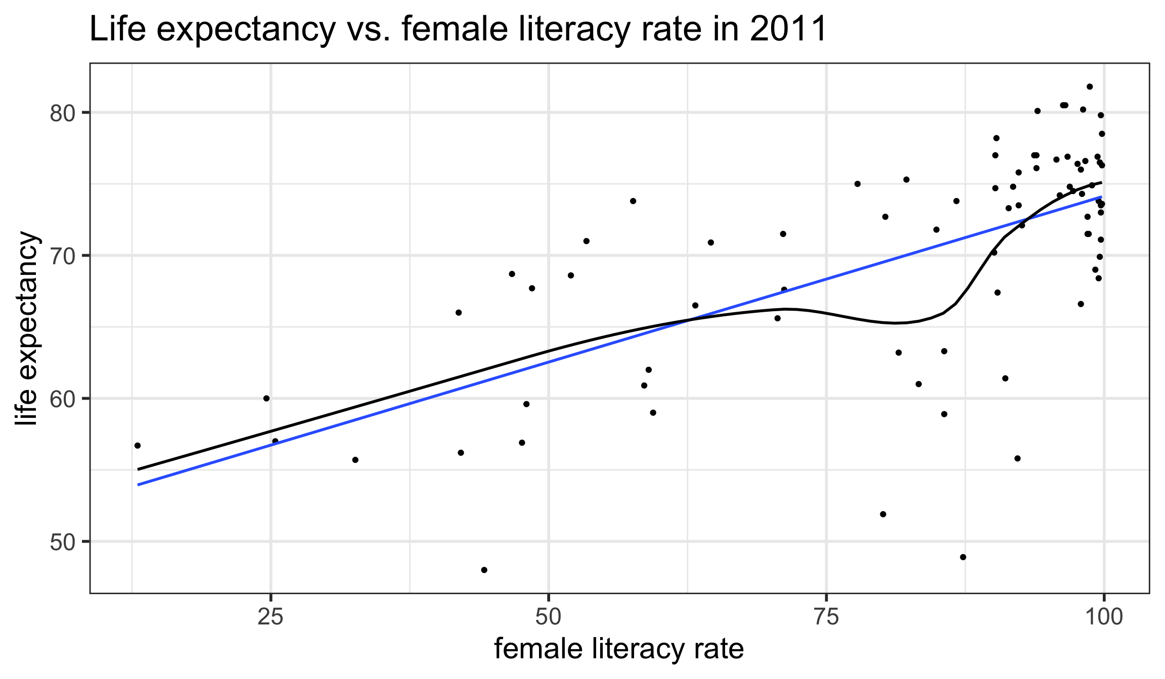
ggplot (gapm,aes (x= female_literacy_rate_2011, y= life_expectancy_years_2011)) + geom_point ()+ geom_smooth (method = lm, se= TRUE )+ ggtitle ("Life expectancy vs. female literacy rate" )
`geom_smooth()` using formula = 'y ~ x'
Width of confidence bands for mean response \(\mu_{Y|x^*}\)
For what values of \(x^*\) are the confidence bands (intervals) narrowest? widest?
\[\begin{align}
\widehat{E[Y|x^*]} &\pm t_{n-2}^* \cdot SE_{\widehat{E[Y|x^*]}}\\
\widehat{E[Y|x^*]} &\pm t_{n-2}^* \cdot s_{residuals} \sqrt{\frac{1}{n} + \frac{(x^* - \bar{x})^2}{(n-1)s_x^2}}
\end{align}\]
`geom_smooth()` using formula = 'y ~ x'
Prediction interval for predicting individual observations
We do not call this interval a CI since \(Y\) is a random variable instead of a parameter
The form is similar to a CI though:
\[\widehat{Y|x^*} \pm t_{n-2}^* \cdot s_{residuals} \sqrt{1 + \frac{1}{n} + \frac{(x^* - \bar{x})^2}{(n-1)s_x^2}}\]
Note that the only difference to the CI for a mean value of y is the additional 1+ under the square root.
Example: Prediction interval
Find the 95% prediction interval for the life expectancy when the female literacy rate is 60.
\[\begin{align}
\widehat{Y|x^*} &\pm t_{n-2}^* \cdot s_{residuals} \sqrt{1 + \frac{1}{n} + \frac{(x^* - \bar{x})^2}{(n-1)s_x^2}}\\
64.8596 &\pm 1.990847 \cdot 6.142157 \sqrt{1+\frac{1}{80} + \frac{(60 - 81.65375)^2}{(80-1)21.95371^2}}\\
(52.48072 &, 77.23849)
\end{align}\]
<- 50.9278981 + 0.2321951 * 60 )<- qt (.975 , df = 78 ))<- glance (model1)$ sigma)
<- mean (gapm$ female_literacy_rate_2011))<- sd (gapm$ female_literacy_rate_2011))
<- s_resid * sqrt (1 + 1 / n + (60 - mx)^ 2 / ((n-1 )* s_x^ 2 )))
<- SE_Ypred* tstar)
Example: Using R for prediction interval
Find the 95% prediction intervals for the life expectancy when the female literacy rate is 40, 60, and 80.
# previously defined for CI's
  female_literacy_rate_2011
1                        40
2                        60
3                        80
predict (model1, newdata= newdata, interval= "prediction" ) # prediction instead of "confidence"
       fit      lwr      upr
1 60.21570 47.63758 72.79382
2 64.85961 52.48072 77.23849
3 69.50351 57.19879 81.80823
Interpretation
We are 95% confident that a new selected country with a 60% female literacy rate will have a life expectancy between 52.5 and 77.2 years.
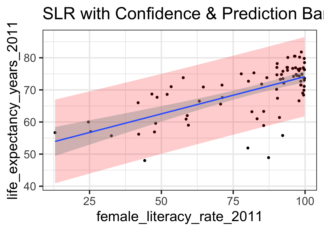
Prediction bands vs. confidence bands (1/2)
Create a scatterplot with the regression line, 95% confidence bands, and 95% prediction bands.
First create a data frame with the original data points (both x and y values), their respective predicted values, andtheir respective prediction intervals
Can do this with augment() from the broom package.
<- augment (model1, interval = "prediction" )# take a look at new object: names (model1_pred_bands)
 [1] "life_expectancy_years_2011" "female_literacy_rate_2011"
 [3] ".fitted"                    ".lower"
 [5] ".upper"                     ".resid"
 [7] ".hat"                       ".sigma"
 [9] ".cooksd"                    ".std.resid"
# glimpse of select variables of interest: %>% select (life_expectancy_years_2011, female_literacy_rate_2011, : .upper) %>% glimpse ()
Rows: 80
Columns: 5
$ life_expectancy_years_2011 <dbl> 56.7, 76.7, 60.9, 76.9, 76.0, 73.8, 71.0, 7…
$ female_literacy_rate_2011  <dbl> 13.0, 95.7, 58.6, 99.4, 97.9, 99.5, 53.4, 9…
$ .fitted                    <dbl> 53.94643, 73.14897, 64.53453, 74.00809, 73.…
$ .lower                     <dbl> 40.91166, 60.81324, 52.14572, 61.65365, 61.…
$ .upper                     <dbl> 66.98121, 85.48470, 76.92334, 86.36253, 86.…
Prediction bands vs. confidence bands (2/2)
 [1] "life_expectancy_years_2011" "female_literacy_rate_2011"
 [3] ".fitted"                    ".lower"
 [5] ".upper"                     ".resid"
 [7] ".hat"                       ".sigma"
 [9] ".cooksd"                    ".std.resid"
ggplot (model1_pred_bands, aes (x= female_literacy_rate_2011, y= life_expectancy_years_2011)) + geom_point () + geom_ribbon (aes (ymin = .lower, ymax = .upper), # prediction bands alpha = 0.2 , fill = "red" ) + geom_smooth (method= lm) + # confidence bands labs (title = "SLR with Confidence & Prediction Bands" )
`geom_smooth()` using formula = 'y ~ x'
Caution…
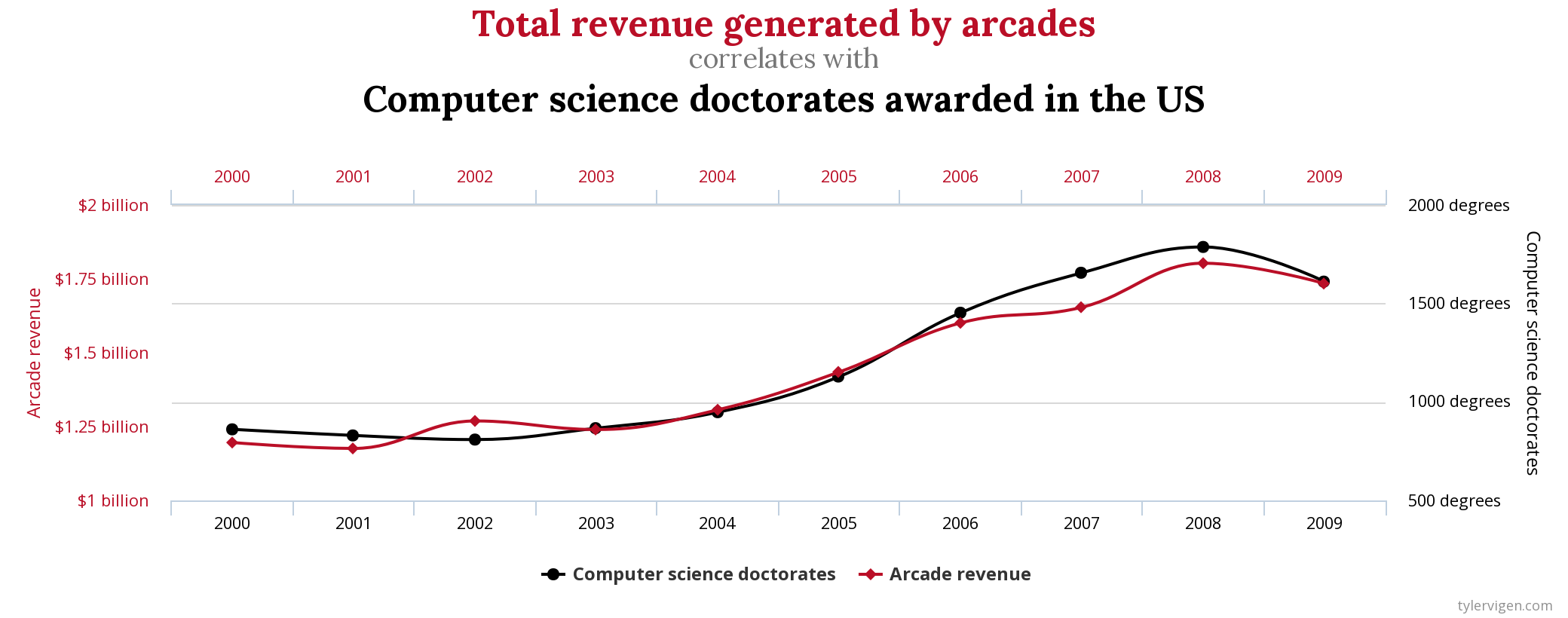
Corrrelation doesn’t imply causation*!
This might seem obvious, but make sure to not write your analysis results in a way that implies causation if the study design doesn’t warrant it (such as an observational study).
Beware of spurious correlations: http://www.tylervigen.com/spurious-correlations